 |
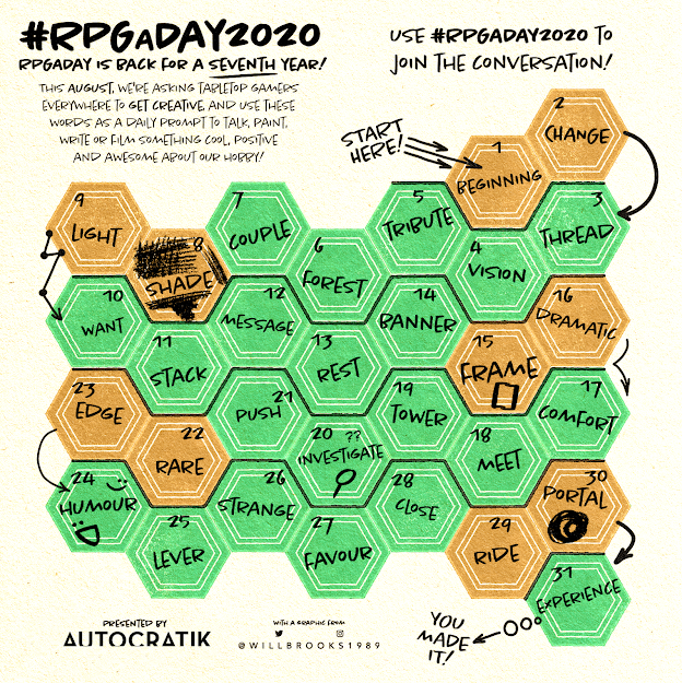
| Day 9 - Light |
Light.
Less is more in RPG books.
Space around the text makes a book easier to parse and understand, letting the text breathe. It doesn't need to be white space, Fria Ligan's Alien does this very well with a black background [1]. If a text is dense and swamped by colour and complicated layout, you can't read it quickly and well.
It's a similar thing with the expression of the game's rules. They need to be presented authoritatively, succinctly and clearly. Rambling text that lacks a lightness of touch undermines the ability to find and reference material and to understand it quickly.
And don't ever present a game with the text and layout printed on greyness like Mongoose used to.
9 August 2020
[1] They do it less well in Coriolis, where finding anything in the book is a challenge. Fortunately, they have a great index which lets them get away with this. Usually their games are great from a layout perspective.
No comments:
Post a Comment