Showing posts with label Technology. Show all posts

19 July 2025

First Impressions - Keychron K10 Max

A photo of a Keychron K10 Max keyboard on a desk. The keyboard frame is black, and most of the keys are a dark grey blue. The ESC key is orange, and the function and modifier keys a lighter grey.

I've been intrigued by mechanical keyboards for a while, mainly driven by memories of the original keyboards that I used when I first started computing. Specifically the keyboard on the Video Genie TRS-80 clone, my old PowerBook 190cs and a variety of IBM keyboards from early PCs.

My daily driver keyboard is a Logitech MX S, wireless, suitable for Windows or Mac (or ChromeOS). It feels light and comfortable to use, and it's very quiet. I can use it for work happily and heavily for a day without any issues. That's important, as I managed to damage a tendon many years ago when I was writing a lot of specifications and doing a lot of CAD drawings. The culprit wasn't actually the keyboard, but rather the very strange lumpy mouse that they produced in the 1990s which meant my hand (and tendon) were twisted when using it. 


A photograph of a Microsoft Serial Mouse 2.0A-8521 - it has a lump on the left hand side and a serial connector. The mouse is beige, has two buttons and a small grey Microsoft logo.


I do believe in not skimping of the quality of keyboard that you use. If you're a screen worker, this is the primary element that you will be engaging with so it needs to be comfortable and well built to make sure that you minimise the risk of harm to yourself and get the maximum user pleasure from typing on it. The MX S is a solid quality build. My first lasted four years until I wore out two of the higher use keys enough that they were erratic in use.

However, I miss the tactile feedback and sound of the keys clacking that I remember of old. I remembered something satisfying in typing on a keyboard like that. Was it just nostalgia?

I ended up looking at quite a few keyboard reviews over the last two years, and was hankering after trying one of Keychron's models based on some comments by folks whose opinions that I have time for. So I ended up selecting a Keychron K10 Max. It's a full size keyboard with a numeric keypad. It's reasonably plain, and I went with a dark colour as I have memories of the way that some keyboards build up residues which show if they're lighter colours. 

I selected Brown Switches because they are a halfway house - tactile but quieter than the Blue switches but not a linear response like the Red gaming switches. It took a while to understand exactly how this worked and I found this article really useful.

It took just over a week to get to me from China, and I immediately noticed the heft of the keyboard when I opened the box. I'd happily carry the Logitech MX S with me somewhere, but I think that this is definitely one that is going to stay on my desk. 

The keyboard came configured UK-ISO set up for a Mac. The keyboard can be switched between Mac and Windows but if you want Windows symbols you will need to swap out the Mac specific keys for Windows ones. These are provided, along with the necessary tools and instructions. The keyboard can be used with Bluetooth or directly wired. It will support up to three different devices at once over Bluetooth, which seems to be the norm for the technology. The Mac set up means I will resist the urge to pair it with my work laptop.

The keyboard itself has a white backlight and   you can select how it behaves. Apparently you can connect into it and edit the settings quite heavily, but I've had no need to do this at all. Battery charging is via USB-C, and it either has a smaller battery or consumes much more energy than my MX S as I've had to charge it twice in the last week of use.

So what's my verdict? 

I really like the keyboard. There's a lovely tactile feel from it and the keyclicks are very reassuring and make me feel like I'm making progress as I am writing. The keyboard is more upright than the MX S which means that I will need to watch that I do not twist the tendon in my right hand and maintain proper posture, but it does feel delightful to use. Perhaps the only thing that irks me is the battery usage, but I'll see how that plays out. It's not really a hardship as there's a USB hub immediately behind the keyboard on the desk so I can easily top it up.

I'm happy I've got this, there's no regrets. There may have been some nostalgia in the purchase but using the keyboard shows me that it was more than justified.

Recommended.

19 July 2025


Longplay is now available on the Mac

A screenshot of Longplay on macOS. The window has music player controls at the top and then has album covers showing, sized by the number of times that they've been played.

One of my favourite iOS apps, Longplay, is now available on macOS, either directly from the publisher or via the Mac App Store. I originally posted about the iPhone version back in January 2021.
TL;DR: One of my favourite iOS apps is now available on macOS. This presents your digital music albums as wall of covers. It's very configurable so you can go all High Fidelity and choose your own sorting scheme.
It's a very simple concept; it just shows the album covers of the music that you have. You select an album and it plays the whole thing. 

The image above shows you everything that you need to know, and will probably give you a good flavour on the albums I've played a lot (at least since I got this MacBook Pro).

You can nuance that. For example, I usually sort the albums in priority of addiction and have the size increase the more plays that the album has had. You could reverse that and do it by how much you've neglected the album.

You can also have the player controls only start or stop the album, or allow access to move forward and back amongst the apps.

I love the app because it reminds me of browsing through my old CD collection. You can see the images and get reminded of albums that you used to love, or that you meant to give another go. You can do this with the Music app, but it's nowhere near as delightful.

It looks like the publisher has a trial version on their website, if this sounds like something you'd like.

19 July 2025

13 April 2025

AI and the Games Master

Screenshot of NotebookLM on Google in a Safari macOS dark mode window. There are three panes showing. From left to right; a pane with all the source datasets (PDFs in this case), a pane with the live queries, and a pane with the saved outputs.


There's a general backlash against AI in a lot of the gaming space, but I think that it could be extremely useful, especially if you're the GM.

Recently, I've been trying out Google's NotebookLM to analyse text. The T&Cs state that the data you upload isn't used to train the AI and that it remains private. I've experimented with Shadows of Atlantis for Achtung! Cthulhu. I struggled throughout the campaign that I ran because it was very overwritten and some of the editing between editions lost elements. I often found myself hunting for a reference in the text. The natural language queries allowed me to pull out some very succinct summaries. Unfortunately, I found it when I had a two sessions left to run.

More recently, I have uploaded the books for the Traveller Deepnight Revelation campaign (see screenshot). There are 11 books (4 from box set, 6 expansions and an adjacent adventure) and this is a game changer in how you can find things. Think of it as semi-intelligent search and summarising. NotebookLM shows were all the summaries come from so you can check it and you can produce timelines, mindmaps and more.

I got some good use from queries like: 
  • Give a summary of the named crew members on the Deepnight Revelation, their motivations and how they impact the plot.
  • Give a breakdown of the locations on Alpha in Deepnight Legacy and include the information that can be learned and threats at each.
  • What steps should the Travellers take to ensure that they succeed and survive the events of Deepnight Legacy?
  • What are the key locations that Deepnight Revelation can use for resupply?
  • Summarise the events in the Riftsedge Transit 
  • Compare the way that characters can resolve the events of 'Deepnight Legacy' and 'Deepnight Endeavour'.
I think that this would also be useful for large tomes like Ptolus or perhaps the recent Forbidden North OSR tomes. Of course, there's part of me that would love to upload all the Traveller canon to get that searchable like this, but it would break the limits.

Screenshot of macOS Safari browser window showing the Tabletop Recorder website. This has the heading 'Tabletop Recorder, Automating Campaign Notes for RPGs'. There's a picture of a gaming group playing D&D, with a phone held in front of them with the app interface. To the side is a sub-heading 'Less Busy Work, More Dragon Slaying' with a set of bullet points below explaining key features.


I've also seen Tabletop Recorder, which is on Kickstarter at the moment.

https://tabletoprecorder.com/

This is designed to take an audio recording of your game session and produce a summary, cutting the meandering side conversations and allowing you to produce output at a variety of levels. Initially I scoffed, but now I think about it, it would be useful for longer campaigns or more episodic games as a reference. When I think how long I spent taking notes during Curse of Strahd, it makes me wonder if this would have been a useful investment. I suspect that it would have been really useful for Eternal Lies too, with all the threads that has. I may trial back it to see how it works.

The part that will make and break it will be how well it handles names etc and how well it filters out the cruft. I've seen some alpha test output and it looks pretty good.

Have you experimented with some of the AI tools out there? Does anything look like it may change the way that you play or GM?

13 April 2025

08 September 2024

New reMarkable Paper Pro


Screenshot of the reMarkable Paper Pro web page, showing the new colour device and price.
The new Paper Pro

I really like the look of the new reMarkable Paper Pro device. This is an 11.8" e-Ink colour display that was announced this week. I love the way that reMarkable are so focused on the design of the device so it does what they want it to. They've tailored the screen, the pen and have moved a unibody design. This is a colour writing tablet unlike any other. It's a little bit bigger than my reMarkable 2, and it has the kind of performance jumps that you'd expect from four years of development. It doesn't replace the rM2, but I won't be surprised if they eventually do an rM3 in the future as a lower end device.

My Deep Guide initial impressions

The initial view on My Deep Guide definitely shows the care that's been put into the device. However, it's expensive. From a personal note, the cost is enough that I'm happy to stay with my rM2 for the foreseeable future. However, in the event that circumstances change, for example my existing device fails, I do reserve the right to change my mind1

8 September 2024


29 August 2024

#RPGaDay2024 - 29 - Awesome App

The RPGaDay2024 graphic. Three columns of prompts for discussions about RPGs. You can find a full text list atP https://www.autocratik.com/2024/07/announcing-rpgaday2024-for-august.html
This year's RPGaDay (full text list here)

Q. Awesome App?

A.  Dice by pCalc (macOS, iOS, iPadOS, WatchOS).

This is a Dice Roller app by James Thomson (who also wrote the great calculator app pCalc). I love the simplicity and aesthetics of the application. The iOS, iPadOS and macOS apps all look very similar but scale differently.

Dice by pCalc (macOS window). Yellow D6 with a 4 in the middle, to the left dice types, to the right other functions, and the usual macOS window title and tools at the top.
A window screenshot from Dice by pCalc (macOS)

The Apple Watch version also is fun and looks great.

Dice by pCalc on Apple Watch Ultra series - there is a silver D6 showing a 4 on a mock wood surface.
Dice by pCalc on an Apple Watch

I just like the way this app is built.

29 August 2024

29 May 2024

A Paperwhite experience

Kindle Paperwhite 2021 lying at an angle on a white fabric with blue, yellow and pink/purple stripes. The screen shows the cover of Adrian Tchaikovsky's "And Put Away Childish Things" which has a wardrobe in a snowy wood.
Kindle Paperwhite 2021

The replacement Kindle Paperwhite 2021 arrived the same day as I ordered it and wrote the first blog piece (the cover took another day to arrive) and I've used it heavily over the last few days. It's a 16GB WiFi Paperwhite without Ads. Build quality feels excellent, at least on a par with the Oasis. The screen is flush and has a slight tactile feel. The charging connection is USB C (which I welcome over the old and slow charging Micro-USB).

Kindle Paperwhite 2021 - standing on a backlit iPad keyboard, backlit by iPad behind. The Paperwhite is on the Library screen sorted by list with 5 books showing with thumbnails and status. The photo shows the amber hue from the warm light setting.
Showing the warm light effect on the Paperwhite. Indistinguishable from the Oasis version.

Screen quality feels as good as the Oasis, and the device feel snappier in use. The screen feels slightly taller and narrower but I suspect that's the 6.8" vs 7.0" coming out, and also the asymmetric design of the Oasis which makes it feel wider. I didn't really notice the lack of auto-brightness but now I think on, I think I'd overrode that setting. The warm-light setting feels very much the same as the Oasis.

Battery is noticeably better. I wonder if part of that is because the Paperwhite doesn't have a cellular connection? However, I do usually run in airplane mode so it shouldn't make that much difference. It may also be the number of backlight LEDs (the Oasis has 25, the Paperwhite 17). However, it's just noticeably better. I suppose that shouldn't be a surprise as the Kindle Voyage was also much better than the Oasis.

The buttons; I miss the tactile feel of the buttons and the fact that you can rotate the Oasis to use it left or right-handed easily. I found the touch controls intuitive, but I'm surprised you can't select the handedness of the device in settings. That seems like a silly miss from Amazon. Control is fine for me if I use it left-handed (I'm a righty) but less useful when held right handed.

Overall, I'm pleased with the change and don't feel like it's a step back. Happy with this new version so far.

29 May 2024

27 May 2024

Goodbye old friend - leaving the Oasis

Kindle Oasis on start screen, buttons to the left, hand to the left
Wiped and ready to go

I read a fair bit, somewhere between 80-100 books a year. You may have read my posts related to that. I was given a Kindle Keyboard many years ago (for my 40th birthday), partly as part of the better half’s plan to reduce the number of books that I had in the house. That plan kind of worked.

The first Kindle Keyboard died after 364 days but Amazon Customer Services were solid and replaced it free of cost. The second one lasted quite a while. However, I eventually upgraded to a Kindle Voyage because it had a backlight and a higher quality screen. The backlight means I can read in bed without disturbing the better half. I liked the Voyage, but the ergonomics weren’t quite right. On extended reading sessions, the edge of the reader could dig into you. However, I loved the haptic buttons. I prefer the tactile button pressing options.

I picked up a Kindle Oasis on eBay from a store that was closing down. It was a huge jump; bigger screen, proper buttons and the ability to have a slightly amber screen at night. An absolutely lovely device. However, the battery life was always a bit poor, and increasingly I’ve come to it to find that it is empty of charge. It’s really frustrating when I’m travelling and a device I charged a couple of days before is now flat, especially as it can take a while to take enough charge to restart.

I’ve had it four years, so it could be battery deterioration. However doesn't go through anywhere near as many charge cycles as a phone for example, and they usually talk about lithium cells being solid for at least 500 cycles. However, it still works okay so I figured perhaps this was time for a change.

Anyway, frustrations boiled over (very first world) and I’ve just traded my Oasis in for a new generation Paperwhite (which was on offer for the bank holiday weekend). The screen is a bit smaller (6.8” vs 7.0”), but it does do amber (albeit it is a manual brightness adjustment) and goes to a USB C connector. The only thing that concerns me as I wait for it to arrive is the lack of buttons. Will that be frustrating? Is the tactile experience as big a thing for me as I think it is?

I’ll play it by ear, but if the worst comes to the worst, I do know that the trade in value and the 20% voucher towards another Kindle mean that I can pass the Paperwhite onto another family member and pick up a new Oasis at under half price.

27 May 2024

13 April 2024

Arcade Club (Leeds)

Photo of a younger teenager in a yellow and grey hood sat in an Atari Star Wars pod. The screen is on the left and shows a wireframe of the attack on the Death Star Trench.
Atari Star Wars

I took the last Friday of the school holiday off, and took the youngster out for a trip to Arcade Club in Leeds. It’s a bit of a run for us (the opposite side of the city) but it turned out to be a fun afternoon. Arcade Club has three floors packed with a huge number of arcade consoles from the 1970s onwards. The ground floor has machines from the 1990s onwards, including rhythm games, pin ball and the classics like Daytona and Sega Rally. The mezzanine floor is filled with all the classic coin-ops I remember from the 1980s, and the top floor has fighting games, VR, consoles, and more Japanese style sit at consoles.

You play a flat entrance fee, and all the games are on free vend. We were hit with a wave of sound as we came in; the ground floor is a storm of noise. The staff were friendly, and we also had a break at the cafe, which wasn’t overpriced at all. There is a reasonable bar selection, probably aimed at catering for the crowd after the post 6pm ‘no kids’ cut off.

We tried a couple of games on the ground floor; Ridge Racer, Sega Rally and a flying game called Afterburner, but quickly went upstairs. The youngster wanted to try some of the classics. Immediately after we got upstairs he was in the Atari Star Wars pod. This was the classic wire-frame Death Star attack (which he’d played as a kid on my old iPad). He loved it.

We then went around and played loads of machines. 

  • Space Invaders (where I got asked why they were getting faster!)
  • Galaxian (we played this one a fair bit)
  • Galaga
  • Frogger (he thrashed me at this)
  • Pac Man (I thrashed him at this)
  • Moon Patrol (he loved this)
  • Centipede (he loved this)
  • Millipede
  • Battlezone (I found the excitement I had over this has been eclipsed by World of Tanks)
  • Missile Command (he got good at this quickly but we all died)
  • Paperboy (he loved this)
  • Asteroids (this was one he struggled with)
  • Robotron
  • Defender (he wouldn’t touch this - said it looked too complex)
  • Star Gate (same as Defender, which it’s an evolution of)
  • Tempest (my favourite but he wouldn’t play it as he didn’t like the look of the controller)
  • Scramble (looked very much like the BBC Model B version in a cabinet)
  • Return of the Jedi (looked very much like a game I vaguely remember on the ZX Spectrum with Speeder Bikes)
  • Hot Rod (an up-to four person game where he thrashed me)
I’m sure that I missed some out. The youngster made a joke that I loved the Atari corner, but I also seemed to like games with odd controllers (track balls, rotary or spinning action). Tempest was the highlight of my visit; I’ve never played it for real in an arcade, but absolutely loved Tempest 2000 on the Atari Jaguar.

We spent nearly four hours there, so it was a good afternoon out. It’s work noting the car parking is only 90 minutes, but you can park for free for an unlimited time at the Morrisons/Retail Park opposite. 

Definitely recommended. There are other sites (eg Bury) that friends have also said good things about.

13 April 2024

13 January 2024

[reMarkable 2] 3 Years On…

A reMarkable 2 tablet held in a grey polymer folio case with the reMarkable logo on the bottom right in white.
Well used reMarkable 2

I’ve been using my reMarkable 2 since November 2020 (Batch 5 preorder).  It’s worked solidly since then, used multiple times daily at work and for home activities. I know at least five people who’ve bought one having tried mine (plus one who got a Kindle Scribe and another who got a Boox). I bought my eldest a second hand rM1 for college which he loves (I do like the robustness of that version). 


I keep it in the tablet sleeve you can see behind it when I’m not using it. I finished the first lot of nibs about 3 months ago. I have the marker plus and it’s still working fine. I did clean the folio last year following advice from here. The edges are a little frayed and you can see the use, but it looks smart still. 


The battery life is good (but I mainly work in airport mode). 


I’ve tried the Lamy, the Norris Jumbo and the HP pens and each of them are great for the right mood but I keep coming back to the marker plus. 


I love using it outside in the summer; sometimes I’ll step away from the teams calls and just use the phone. 


It’s been updated at least 20 times as the software has got much better (the only bit I’m not so hot on is the way OCR works now). I’ve never gone beta as this is a work tool for me. 


I scanned my old Leuchterm and Moleskine notebooks to PDF and added them in as a reference. 


It just works. 


I do treat it like a £500 device (which it was with the accessories) and look after it. I’d replace it in an instant if it broke. 


I’m posting this because all too often all we see are the stories when something has gone wrong. After three years, this still delights me everyday.

30 September 2023

First Impressions - Playdate, a retro-handheld by Panic

Picture of a yellow rectangular box with a picture of a Playdate handheld and a smaller purple square box showing a Playdate cover, both resting on a table with a world map on it, and inclined on a black keyboard at the top of the picture.
The Playdate packaging is cute.

Back in March 2023, I impulsively ordered a Playdate handheld. I’d been intrigued when they first came out, but resisted. However, I’d seen a few reviews, and as I’ve been travelling more, it seemed like a cute option to do some casual gaming when I was away. Plus, Panic had announced there was a price increase coming so it seemed like a good time to lock in a device at the launch price. 


Same set up as the first picture, but showing the back of the boxes
The back of the boxes

The Playdate is Panic’s first foray into hardware; usually they produce software, mainly for macOS (but they have also published for Windows and XBox with games like Firewatch and Untitled Goose Game). The little yellow handheld they’ve produced is pretty open; they encourage side loading of games and there’s an active Itch.io community. Most of the games are pretty cheap; an expensive one would be around the $12 range, but many are Pay-what-you-want or in the $2 to $4 range.


The Playdate box opened, showing the little yellow handheld in foam at a jaunty angle, alongside a similarly jauntil placed black cardboard sleeved yellow USB cable with the words “Have Fun” written on the sleeve
Unboxed…

The device is really cute looking and very small. It has a highly reflective black and white LCD screen, a D-Pad and two buttons (A and B) for gaming, plus a button at the top right to access menus, and another button on the top right to power on and off. And then there’s the crank, an analogue controller which is used in some games and also in some system functions like buying and opening games. It charges and connects over USB-C and a 3.5mm headphone stereo jack at the bottom. The device’s speakers are mono and sound decent enough. There’s also a microphone, but I’ve not seen anything use that yet. The Playdate connects to WiFi and you can download games and updates from Panic.

Playdate held in my hand, showing the clock in sleep mode. The clock is set to “words” mode, rather than digital or analogue. It says “It’s five to five on Monday September 25”
Tiny handheld, interesting clock options 

There are three routes to getting games; the device comes some (‘Season One’) arriving with two, and then having more two more games drop for free each week. In total there are 24 games, with a wide variety of options. The second route is to install the Catalog app, and you can buy from a curated collection of games hosted by Panic. Finally, you can buy games from other sources like Itch.io or even code them yourself and sideload them over WiFi or over USB. 


Playdate handheld, purple cover open, showing the Catalog app loading games. It’s connected to USB to charge with an iPhone 11 to the right of it to provide scale.
Playdate charging while downloading games on the Catalog app, with iPhone 11 for scale.

I’m very much a casual gamer (mostly). Playing through the whole of Firewatch in two evenings is probably the most extended play that I’ve done recently, although I do have a World of Tanks Blitz habit. Most of the games I’ve downloaded are very much bite-size games; they’re your classic arcade games. It actually reminds me of the ZX81 and ZX Spectrum days; I do hope someone comes up with a decent take on 3D Monster Maze soon! I’ve sideloaded a lot of the classics like Frogger, Invaders and Pac Man. There are some great puzzle games; these range from more Sudoku / Minesweeper like games, through to arcade puzzlers where you push and pull things to solve a level. There are adventure games, although I haven’t really explored these properly yet. 

Most games are the kind of entertainment you can play for a bite-sized bit of fun, but it’s also easy to lose an hour.

The screen can be challenging in artificial light; there’s no backlight so you have to angle it right to get the best view. I’ve not really found that an issue, but I have seen people moan about it on the internet.

My favourite games at the moment are SlitherlinkPD (a minesweeper/sudoku style puzzler using the crank to wind back time), Gravity Express (Lunar landings, using the crank to orientate the ship), Grand Tour Legends (crank-driven cycling), Gatecrasher (pilot a ship through a series of gates, kind of Tempest style, using the crank) and Four Corners (kind of Tetris like block clearing game).

I’ve no regrets picking this up, even the wait built some anticipation. (Panic batch manufacture Playdate, so you effectively pre-order; mine took six months to arrive).

The yellow Playdate handheld, sandwiched in its purple cover, held in a hand with a decorative window behind
The Playdate in its cover - reminds me of an ice-cream sandwich.

I’ll leave you with a cute picture of the Playdate in its cover above. I look at it and it makes me smile. Teeny. Cute. Fun.

30 September 2023

29 January 2023

The Bird Site Massacre

Victims of the Bird Site Massacre

So, as I feared, the worst was confirmed; Twitter deliberately killed off the third party clients without notice, despite their helping drive the service's development and often being used by the more active users. Twitterrific and Tweetbot and more gone without warning to company or users. Twitter's developer terms and conditions retroactively changed to make such services unacceptable. 

Confirmation of death - Twitterrific
Confirmation of Ollie's demise

This made the decision to leave the bird site quite easy for me; I exported archives of my data (which come as a funky HTML set up so you can explore them and closed down both my accounts. They'll auto delete in less than a month. The BITS Traveller account is still there but we're discussing what to do with that (and, to be honest, it's mostly been dormant since the pandemic hit). So if you want to find me on social media, you can hook up with me on Mastodon, where I'm on the Dice Camp server using my usual Cybergoths tag (something from university, don't ask!).

It was a strange feeling killing the accounts. I opened the private one on Friday 3 April 2009 at 7:24 in the morning and closed it at 21:40 on 22 January 2023. The public account was started later - Sunday 5 June 2011 at 10:14 - and closed last at 12:19 on 26 Jan 2023. They've been there a while, but increasingly had less value and engagement as the algorithms that drive toward contention made Tweeting more and more like shouting into the void. Twitterrific combated that, but the reduced API access that the application got over time didn't help the bird site be more approachable. Functionally, Twitter has been dying for me for quite some time, so I guess I should thank Space Karen for pushing me over the line to decide to leave. To be honest, using the official Twitter app and website made it clear it wasn't for me anymore.

Failing Twitter Engagement

The failure of Twitter on engagement was shown by a Mastodon toot by Ged Maheux, one of the Iconfactory team. They've 16.1k followers on Twitter and 4.1k on Mastodon. They tweeted the same material on both sites and got 9 likes and 3 retweets on Twitter and 287 favourites and 163 boots on Mastodon. Others are reporting the same.

I like what I see on Mastodon, especially now Tapbots have released Ivory, a Mastodon app for iOS which uses their experience on Tweetbot to create an excellent application which is actively being developed. The basic Mastodon app was fine, but Ivory jumps it to another level. Mastodon reminds me of early Twitter crossed with Google+, which is a good thing. I do get a bit annoyed with some of the others who have fled from Twitter or are hedging their bets on both sites who keep on using Twitter conventions and posting Tweets. I don't want Mastodon to just be another Twitter, I want it to be it's own thing.

Project Phoenix - Twitterrific
Project Phoenix About dialog box.

I do hope that The Iconfactory re-enter the space using their experience from Twitterrific but Tapbots are also doing a great job and winning me over. I had a connection to Twitterrific because it was how I discovered Twitter, and I'd also backed the Kickstarter to update the macOS version of the app to match the iOS one.

Thank you to The Iconfactory for 14 years of excellence, and thank you to Tapbots for making the jump to Mastodon and bringing a great experience.

Let's see where the herd takes us. 

29 January 2023

15 January 2023

Farewell Twitterrific?


Ollie is sad…

About 48 hours ago, the primary way that I access Twitter shutdown. The venerable but still sprightly Twitterrific iOS app lost its API connections that allow it to talk to Twitter. It appears to be a deliberate move from the social media site, but there have been no announcements or communication to the developers. Previously, when the API got changed to limit some functionality to Twitter’s own applications, the developers were briefed in advance. This time, nothing. The only reason it’s thought that it’s a deliberate choice is that there have been leaks from Twitters internal comms. The changes affect the most popular third party connections; Tweetbot as also down. Ironically, at the moment, the macOS version of Twitterrific still works.

It’s suspected that if deliberate, the disconnection happened because the apps allow you to see a linear timeline without promoted posts and advertising driven by the algorithm that now drives the feed that Twitter gives you. Of course, that was the attraction of these apps. Ironically, the previous changes to Twitter’s APIs meant I have their app installed too because it’s the only way to get notifications. This means I get to use their UI pretty regularly, get shown the adverts etc so the reality is that the company isn’t really loosing out.

I’ve loved using Twitterrific; it was an app I got into when I first got into Twitter and had recently become a dad. We used to have Saturday Morning Dad’s club chats on it and more. It has a lovely interface and I will miss it. I’d started to move away from Twitter to Mastodon anyway (which feels like a lovely blend between Google+ and Twitter) and this will only accelerate that move. Once the macOS app goes, so am I (but I’ve left a trail of breadcrumbs in my usernames on Twitter).

As well as its great UI, Twitterrific actually invented the term tweets and created a bird logo which inspired Twitter’s own. It’s an app intimately tied to the history of the service, and it seems almost apt that as the new owner of Twitter burns it down, Twitterrific disappears into memory lane, much loved and missed.

I do hope that the Iconfactory produce an Olliphant app for Mastodon.

Farewell, and thank you.

15 January 2023

Edit: it was deliberate. They killed the entire third party client ecosystem.

02 January 2023

Thinking of the iPad redux

iPad redux

Back in 2019, I mused about whether the iPad was a viable replacement for my Mac. Back then I concluded it wasn’t, but it would do 80% of what I needed day-to-day. Four years on, what’s the state of play?

When I asked that, I was using the iPad mini 4, a 7” device, along with a Logitech keyboard. I’m now using a 10” iPad Air 4 with a Logitech Keyboard with an integrated trackpad. I also have an Apple Pencil 2. So this comparison is with a faster device with a bigger screen and a selection on non-touch pointing devices. iPadOS has moved on significantly since I last looked, and it’s fair to say that there has been a degree of alignment between macOS and iPadOS so the look and feel isn’t that different overall.

I’m already using the iPad for work - with authentication and the Microsoft iPad compatible apps (Office, Outlook, Teams), it’s a very viable work device. Yes, it’s still a bit behind the experience and flexibility of the Mac or the Windows PC, but the gap is significantly closer. I could certainly travel with this and not miss the laptop.

I’ve also got access to apps like Scrivener which are cross platform and perfect for writing long-form for non-work activities.

The Affinity suite is impressive; these are desktop grade apps. I don’t think I’d consider doing something major with them, but I could. I’ve already retouched a few photos and experimented with Designer. Publisher will be interesting when I have a project going (which I hope to soon). My main hesitancy in using them for something major is that my MacBook is a lot faster (MacBook Pro with an M1 Pro versus an A14 chip), and has a bigger screen. It’s better built for heavy lifting. But I could do a book’s layout on the iPad now, which is a world of difference to 2019.

The Pencil is useful for precision work, and the handwriting recognition is very good. The touchpad is brilliantly done; it moves like you’d expect, but whenever it crosses a touch target, it highlights subtly. 

The Files app now feels like a desktop experience for accessing files; sometimes a bit clunky, but very much a decent interface and experience.

All the barriers have gone. 

So to my question, could I replace my Mac with an iPad? The answer is now a conditional ‘yes’. There would be some compromises, but the state of the art has moved. I think the iPad can easily do 90% of what a Mac can. However, there are some power apps and flexibility it can’t do. I suspect that the convergence will continue over time (especially as the M-series Macs can run iPad apps). 

2 January 2023

10 December 2022

Initial thoughts on iPad Air 4

iPads
All the fours - iPad mini 4 and iPad Air 4

After some thoughts, I’ve upgraded my iPad. The main motivations were that I don’t really want to take my MacBook 14” out on the road if I don’t need to, plus the fact that the iPad mini is now obsolete in operating system terms. That said, I bought the mini when it was released in 2015, so it’s done seven years which is a lifetime in technology terms. It’s only really been the last 12 months when it’s started to feel slow.

It took a while to decide what model to replace it with. I know I wanted a cellular capable iPad (the last two iPads I have owned have had that functionality and it’s been really useful). The big decision was screen size. My first iPad was the original with the 10” screen, but my second and third units had the iPad mini form factor. I’d used the iPad minis regularly travelling on the train to London with work when I was at Unilever. It was really portable and useful. However, my close vision has deteriorated slightly (always short-sighted, I needed to switch to varifocals for reading reasons), so I decided that it would be better to go back to the larger form factor. I knew I didn’t want the 12” screen size on the iPad Pro; I still wanted portability and I always have the MacBook as an option.

I knew I wanted more than 64Gb of storage; one of my use scenarios is reading RPG books that I have on PDF, and that usually ends up taking several gigabytes of storage. It had become tight on the iPad mini 4 as the apps I had installed also ate a lot of space. I figured 128Gb or 256Gb was the right kind of storage. I’d used laptops with that happily. When I was using Chromebooks, I tended to stick an SD card in that added 128Gb to store this kind of thing. As external storage wasn’t an option with the iPad, it meant the initial purchase had to be right.

I wanted a bit more power than the base iPad model, so that left me with the Pro or Air. That led me down a rabbit-hole of whether I wanted to get onboard the M-series processor train. iPadOS already is getting features that don’t work on the iPhone processor based lower end models. In the end, I decided that the price jump to the M-series wasn’t worth it for the power difference I could get with the upgrade. I ended up looking at the iPad Air 4 and the iPad Pro (2020). These had A14 and A12Z processors respectively. I was looking on the Apple refurbished store (which gives you fully warranted devices but in a white box - they feel as well presented as a new device). In the end, I came to the conclusion that I’d go with the iPad Air and the A14. Looking on Geekbench, this was about a 25x processing speed jump compared to the A8 on my iPad mini; the M-series iPad Air 5 would be nearer 32x faster, but I figured that this would be more than enough for the next five years. I picked the 256Gb option for storage.

I picked up an Apple Pencil 2 (via Amazon as £15 less than Apple) and then started looking at keyboard cases. I’ve used a keyboard with the iPad from the original model in 2010, as it adds a lot of flexibility. I settled on the Logitech Combo Touch. This has a trackpad, backlighting and space to place the Apple Pencil to charge. I’ve used Logitech keyboards extensively and they’re usually quality with a good typing experience. I did consider the Magic Keyboard (lovely but £300), and the Folio Keyboard (£200) from Apple, but the Logitech was significantly cheaper (£150 RRP but £110 at Amazon) so that was me decided.

I’ve been saving to do the replacement over the last year, so placed the orders.

DPD are running a day behind around Leeds, so I spent a day or so looking at a keyboard case waiting for the iPad to fill it. Once it arrived, the fun started in a good way.

My old iPad had a notification in system settings that my new device was coming. I gave me instructions and all I had to do was to bring the two close together and scan what was on the screen on the iPad mini with the iPad Air. It then pulled across all my data and apps via iCloud. The experience was seamless.

The new machine feels buttery-smooth and the gradual convergence between iPadOS and macOS means that there isn’t a huge difference in experience so far. I could imagine a scenario where a keyboard and touchpad equipped iPad Air or Pro replaced a laptop for general use. The touchpad is a game changer. iPadOS is built for it; if you come from a laptop you’ll find it very natural to use. It’s quick - loading into World of Tanks Blitz onto a map takes less than five seconds whereas it could take thirty seconds on a bad day once you got out of the queue with the 2015 machine. It has desktop class apps (Affinity Suite, decent versions of Microsoft Office) which are no longer screen-size increased phone apps. I can use this as a portable work device as well; no more struggling with a phone keyboard if I get contacted when away.

The keyboard case detaches magnetically so it’s really easy to just switch to a tablet view. The screen is bright and clear, and reading full size RPG books is easy.

That said, the MacBook has a lot more power and can do more complicated things. There’s definitely a use-case for that. I’d only consider playing RPGs on a VTT as a player with the iPad. Although I may experiment to see how Role works. It also won’t replace my reMarkable day to day. The experience of writing on glass isn’t as pleasant and the shear level of focus the rM gives me mean I’m happy with that experience.

This is a world from the iPad experience that I first had in 2010. Apple’s tablet has grown up and become something much more than a big screen iPhone. The interactions with keyboards and trackpads add another layer of experience and iPadOS is much closer to macOS now. The user experience upgrading is graceful and frustration free and quick. I’m impressed.

10th December 2022

23 November 2022

First Impressions - Lamy Al-Star EMR pen for use with reMarkable

Lamy Al-Star EMR
Pen down at the end of the review...

I've tried a number of pens for the reMarkable to try and give a bit of variety to the feel of my writing. I noticed the Lamy Al-Star pen on offer as part of Amazon's Black Friday promos, and decided to order one once I'd ascertained that it was a genuine reduction.

The Al-Star has the same design ethos as many of Lamy's pens and feels nicely robust to use. It is made of plastic, but there's a solidity to it. It feels lighter than the Marker+ which came with my reMarkable.

One of the great things about the Lamy is that it happily takes reMarkable nibs. These feel better than those that come with it.

The downside is that - unlike the other EMR styli that I own - it doesn't have a working eraser. There is a button that could be used to trigger an erase action but you need to have a hack installed to do that. I'm prepared to side load templates, but hacking the underlying LINUX is going further than l'm willing to go. I hadn't realised quite how often I used the eraser until I started writing this piece. Not a deal breaker, just a little frustrating.

The feel of the pen is much more like a traditional fountain pen. I'm finding it less controlled than my usual Marker+, but that may just be the new nib l'm using. I certainly feel that my handwriting is looser with it.

Overall, this feels quality and seems to write well. The only downside is the lack of an eraser, but you can always use "undo" or the software eraser. A nice extra.


22nd November 2022

29 August 2022

Go home Chrome, you're drunk and intrusive


Chrome is a bit marmite for me. I both love it and hate it. It was fantastic on the Chromebook (no real surprise there) but on macOS it's a pain. For some reason, it persistently reinstalls itself into login items so it opens at start-up. It also isn't very cooperative in quitting when you exit. And finally, even though it's been rewritten as a universal app, it's still an heavy energy user.

That said, it's unavoidable. Some of the apps run better in it, and Roll20 wants it as the browser. So, marmite for me.

29 August 2022

04 August 2022

Publishing a book (from the layout side)

TRIPOD Cover
The final front cover

Longer ago than I'd like to think, Graham Spearing (First Age) invited me to take part in a playtest of a narrative storytelling roleplaying game which I instantly loved. The nature of the mechanics were free flowing and although you could have a powerful character, the use of a dice pool meant that you knew you could also be vulnerable. The engine isn't as swingy as the Year Zero Engine, but it can have definitely have highs and lows. I agreed to do the layout for the game, using Adobe InDesign. It was a learning experience and at the end of it I'd got moderately competent using the desktop publishing software. The final, definitive version was released in 2014, sporting a beautiful abstract cover by Stephanie McAlea. It was about 150 pages long and had hardcover and softcover versions.

Graham started musing about a shortened 'essence' edition a few years ago. One of the attractions of the original release was the voice that it had, but that made it longer than it needed to be. While working on it, he started to streamline the rules, and eventually it was becoming Wordplay 2. Ultimately, the game was renamed to TRIPOD (a play on 'traits in pools of dice') because Wordplay struggled to appear in searches and a lot of people assumed it was something other than a roleplaying game.

As development came to an end, I'd reached a point where I couldn't viably run InDesign anymore and I wasn't ready to pay for a Creative Suite subscription. Instead, I got hold of Affinity Publisher, resigning myself to having to recreate the look and feel from scratch. Graham wanted to show the Wordplay DNA with a similar layout.
 
Affinity Publisher - TRIPOD
The format, imported into Affinity Publisher.

Publisher was developing quickly and soon gained the ability to import an IDML file. I used my old Mac to do this, and the import was perfect. Styles were preserved, as were the master pages. The only fly-in-the-ointment was that Publisher had no equivalent of the book file. In InDesign, you can have an overall book file which draws in independent chapter files for layout and allows you to merge at the end. Instead, I took a chapter file and built out from there so the book had a flat, single-file structure.

The Publisher Workbook and help files meant that I could quickly learn how to do things and get work underway. I had Google Docs open on the laptop screen and Affinity full screen on a monitor; cutting and pasting ensued. The trickiest things were tables. The original ones pulled through, but creating new ones well took a few attempts.

Blue TRIPOD
TRIPOD's cover done in the original Wordplay blue

Graham wanted to use the same cover design, but refresh it. Unfortunately, Stephanie no longer had the master file so I ended up importing the PDF I'd used for the cover printing into Affinity Designer. This worked well but mean that the file was quite messy with way more elements than you'd have got from the original Adobe Illustrator file. I renamed the file and cleaned it up. The need to remove shadows from titles meant that I adopted a flatter look than the original, but this kind of follows modern UI theming. Once I'd completed the blue version, we decided to do a purple one. Back when we'd started talking about Wordplay Essence, we'd planned to use a purple cover, so it seemed appropriate for a book that was coming in at a third of the length.

Purple TRIPOD
Purple mock up.

Once we agreed that purple was the way to go, we needed to get the cover file from DriveThruRPG. Looking at this confirmed that the spine needed to go as the book was now too thin.


Affinity Designer cover work
Cover design in Affinity Designer

This was reasonably simple, as I was working with vector graphics. I had to select the right areas and drop them on the cover document. I put them on another layer to the template so I could play with visibility of items to bring them through. Mainly, I was switching off the purple rectangle in the background.


Don't forget to set the bleeds
Bleed settings

The final hurdle was getting the core text right. I added enough pages to make it a multiple of 6-pages (otherwise Lightning Source add the extras themselves without our control). We had a bit of a fumble until we got the bleed set right, but once that was done everything went forward into clearance. A day or so later it was signed off and Graham ordered the proof.

I'm sitting here hoping that it looks as good printed as it does on the screen, and I'm pretty confident that I can work my way around Publisher now. The MacBook (with a M1 Pro chip) handled the file speedily and without issue, which was great. I'll wait and see if any tweaks are needed, but in the meantime I've at least one long delayed project that I'd like to get laid out. 

4 August 2022

27 January 2022

Back to the Mac

MacBook Pro 14”
Rebooting...

My first new Mac in more than a decade arrived yesterday. I bought a second hand macMini from 2014 a couple of years ago to replace the dead iMac 27", but this time I've replaced the laptop. My last Mac laptop was the first unibody aluminium MacBook from 2008. The line subsequently became the MacBook Pro. Along the way, I switched to an SSD and took the RAM to 8GB (double the official capacity), and it still remains a decent machine. Alas, the battery life is dire and getting a decent replacement is challenging, to say the least. It's also locked on MacOS X 10.11 El Capitan. That isn't an issue in itself, but increasingly it isn't supported by software houses. So it was time to get a new one.

MacBook Pro 14”
It's the little details...

Unboxing a new Mac is always a delight, as Apple has long paid attention to the details of how your new device is presented. There's minimal plastic, and lots of clever folded paper. The computer slowly emerges, and definitely has a wow factor. I went for space grey rather than silver, and it looks lovely. Surprisingly, the Apple stickers are black, which I didn't expect (I've only ever seen white ones for a long time). They look very nice.


MacBook Pro 14”
More stickers...

The machine started up with a delightful bong (loud and decent speakers) and the screen looks lush. This is a retina grade display, with TrueTone, 1000nits, and a refresh rate up to 120Hz. It's amazing how gorgeous it makes things look.

The keyboard is probably the best Mac keyboard I've used since the PowerBook 190cs I started with back in 1996. It feels light and responsive. I'm glad I missed all the shenanigans with the butterfly scissors.

The machine is smaller than my 2008 13" MacBook, despite being 14". The reason is the bezels. These are very narrow, just like my Asus Chromebook, so you end up with a larger display in the same footprint. 

The port selection is decent, with three Thunderbolt class USB-C ports, an SD card slot, and a HDMI port. Pretty much everything that you need. I'd have liked a single USB-A port, but Apple has never looked backwards in these things. 
  
MacBook Pro 14”
Accessibility options

MacOS has been pretty solid on accessibility options over the years, but it's nice to see them front and centre in the set-up screens. They aren't an afterthought, which is progress.

The feel of macOS Monterey is much more like iOS in style than I'm used to; although my macMini runs this version of the OS, I've kept it on Mojave because that was the last version that could run 32bit apps. I'd decided to build this new machine clean, and see if I could reach a point where I'd be comfortable upgrading the older machine. The feel took about twenty-four hours to stop jarring. I'm only noticing it now where icons and controls have moved in apps like Safari. It integrates well, flawlessly linking to my iPhone and the HomePods we have.

In honesty, it has more power than I really need, but that's not an issue. I expect this to be in use for at least five years; it's my fifth Mac laptop, and that's been the life that they typically have. As the newer machines are more limited in upgrade capability, I ended up going mid-spec so there was a degree of future proofing.


MacBook Pro 14”
Coming home.

Switching back to this, I feel like I've come home. I loved my ASUS CT434 Chromebook(*), which was an awesome package for the price, but it always had some limits on what I could do. They were slowly disappearing as ChromeOS developed, but there was always some friction and savvy needed to get the best out of it. The MacBook Pro doesn't have that friction, and it has the software that I need ready immediately. It's familiar (albeit updated) and feels silky-smooth in use. I'm lucky that I could do this.

27 January 2022

(*) In case you're worrying, the Chromebook will go to the eldest once I've power-washed it. That's a ChromeOS term, just to be clear, I'm not planning to get it wet.

02 October 2021

[rM] Release 2.10

V2.10
Latest Release Notes

Release 2.10 landed on my reMarkable on Friday while I was away with work this week; had that moment where I considered waiting until the weekend so I could reload the custom screens and templates, but I plunged on as there was nothing from those that I needed right then.

The update adds basic integration to Google Drive and Dropbox; it allows you to download PDF files directly into the reMarkable and export notebooks back out (as PDF, as you have to export the whole notebook). Upload seems to be to the root directory, but that should be fine if you're from Gen Z or a millennial! This is quite useful; I'll be able to pull down gaming PDFs without going via the desktop app or my phone. I'll also be able to export notes directly rather than going by email and onto a file service.

I love the way that each update - which seem to be arriving 6-8 weeks apart - pushes the envelope of what the reMarkable can do a little; the device I have now has moved a long way on from the device that arrived last November.

2 October 2021


05 September 2021

[rM] A reMarkable thing, ten months on.

reMarkable use scenario
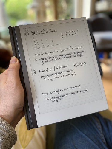
Taking notes on the reMarkable as I read a roleplaying game.

A couple of people have asked me to post about my reMarkable writing tablet, so here are my thoughts on the device after ten months of heavy use. This is not a detailed review of the device, but a talk through of what it is and why I like it. If you want detailed techy details, I suggest a look at My Deep Guide on YouTube as the channel owner loves the platform, produces comprehensive reviews on the updates, and isn't afraid of criticising aspects of the platform.

I'd eyed up the original reMarkable when it first came out but decided against it. It was a lot of money and I wasn't entirely certain that it would fit my workflows. Although an e-Ink writing tablet seemed a great idea, I wasn't sure if it would end up with the same fate as the iPad mini had, being used in a very small number of situations. I was massively encouraged by one of my fellow Travellers, Timothy Collinson, who had given a glowing review of his experience of using a work provided reMarkable 1.

When the reMarkable 2 was announced, the advertising was all over Facebook, and I had changed jobs. I was using several Leuchterm notebooks a year using a nice fountain pen, but the challenge of finding things and the bulk of carrying them as references was a pain. I love the feel of writing with a proper pen, the scratching noise that it makes on paper and the satisfaction that looking back through notes gave me. It looked much more tempting; what swung my decision was the payment for a writing project, which enabled me to pre-order without any real loss. I first checked back in with Timothy, who told me that he hadn't changed his mind and was getting one for his own use.


reMarkable use scenario
Using a storyboard template to plan a presentation for work

What is a reMarkable?
A reMarkable is a 10" ARM-powered tablet that uses an e-Ink display, and an EMR stylus to allow you to write directly on the screen. It runs bespoke software under Linux (and you can hack it if you want). It is designed by a company based in Norway and manufactured - as most technology seems to be - in China. It is extremely thin and quite light. The e-Ink display means that it's fully readable in daylight and has lower power consumption, but it is black & white and the update is slower than the LCDs and OLED displays used by Android tablets and iPads. It isn't backlit, so relies on the ambient light in the same way that a book does. It isn't backlit like modern Kindles (which use similar, smaller displays). 

The EMR stylus uses the graphics tablet technology developed by Wacom and is pressure-sensitive. There are two types available; those with an eraser on top and those without. I have the eraser and wouldn't be without it. You can use alternative makes, such as Staedtler or Lamy. The reMarkable stylus comes with a consumable nib; I've used two in the ten months since I started using the device. The nib - when combined with the screen surface - gives the tactile feel of writing on paper.

But couldn't you do this with an iPad?
Absolutely. You could buy a 10" iPad (the kind that uses the Apple Pencil 2), add the Paperlike screen covering, and get somewhere near. You lose the ability to work outside in bright sunlight, and the feeling won't be the same. You also lose the advantage of the focus it delivers. One of the best things about the reMarkable is the way that it lets you use it as if a pad of paper. It feels like one, and behaves like one, in a way an iPad doesn't. Pads of paper don't flash you with notifications or tempt you to visit a social media site. The iPad is a jack-of-all-trades; the reMarkable has a laser focus on one thing.

What is it like?
The reMarkable 2 is incredibly thin, yet feels solid. It's a quality product. I have mine in the book folio (taking advantage of the large discount at launch) which is great for casual protection but isn't going to protect from impacts or drops especially well. I have an iPad sleeve I use when I'm carrying it around because I treat it like it's £500 of hardware. The Facebook groups are full of horror stories where people forget this and end up cracking the screen or damaging the power connector or button by dropping from a height and yet seeming to be surprised about the outcome. I love the design and feel of the device; it feels good in the hand and in use.

The screen has a slight grey colour, which is to be expected for e-Ink, and isn't backlit. This is partly about the design ethos (paper isn't backlit) and partly about battery life. The writing experience does feel very like a pen to paper, unlike the feel of writing on glass that an iPad gives you. The screen is very responsive - there's no perceptible lag - and accurate except at the very edge (common with other devices that use the Wacom technology). The end result is that my writing looks normal. The screen can show ghosting, but it's rarely noticeable, and a refresh clears it. 

reMarkable tips
Spare marker nibs - found in the pen box.

The pen magnetically attaches to the side, and there's one correct orientation to do this. It's secure enough for casual use but you can brush the pen off like any other magnetic device. The folio cover also attaches magnetically to the device. The screen can become temporarily unresponsive if you put it over a strong magnet (for example lean it on a laptop palm-rest). I've also managed to put my laptop to sleep by putting my reMarkable on top of the open-close magnetic sensor by mistake. The marker-plus pen with the eraser has some heft (in a good way) and feels great in the hand. I've used two nibs since I received the device in November 2020; if you press hard (which isn't necessary) you will use them up faster. I also have a Staedtler Norris Digital Jumbo pen to give me an option to have a different feel in my hand; this works great, but the (once again consumable) nibs have a more rubbery different texture in use.

There are multiple pen types set up in software; ballpoint, fineliner, pencil, mechanical pencil, marker, brush, calligraphy pen. You can change the weight and colour (between white, black and grey). Some of the pens respond to angle and pressure depending on the type they're mimicking. 

PDF and ePub rendering is fine, but it can be slow when the document is large and you first load it in. Colour is rendered in greyscale. You can write on the documents and export a copy PDF out for reference or printing. However, remember that this is like handwriting on a print-out rather than using Acrobat annotation tools.

The reMarkable comes with a wide selection of templates - lined, gridded, storyboards and more. You can use a different one on each page. Officially, you can't add your own but you can use PDF files (but they can't have extra pages added).

reMarkable images
Thumbnail overview

The OS is Linux based and under regular development; the last update (2.9) added a favourites shelf accessible by a swipe and an alternative in document page preview/selector very much like the one on the Kindle. This is in addition to the page overview view which shows thumbnails. I've not had any stability issues with the device.

Page preview on selector
The page selector added in update 2.9

The data on the reMarkable is backed up into Google's cloud infrastructure and the only access into it is through the device or through the companion apps (which use 2FA on set up with the devices). I have installed the iOS & Android apps and the macOS app. If you want to add PDFs or ePubs to the tablet, you use the app. It'd be nice to have an email address route like Kindles do but that doesn't exist at the moment. Cloud sync is pretty fast; obviously, it takes longer if you've been running for longer periods without Wifi. I'll quite often run with no Wifi if I'm away from home and only connect when I need to, using the flight mode to extend the battery life. I get around five to six days from the battery, but I don't use the PDF side too often.

The Promise of Maps (text)
The OCR function works quite well - this is one of this blog's entries.

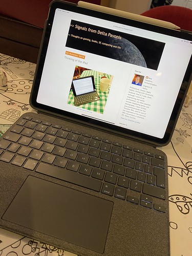
You can export single pages or whole documents, and the device supports PDF, PNG and SVG. Usually, if I want a quick print, I'll print from one of the companion apps as the reMarkable doesn't do it directly. You can also OCR pages directly to text; this does require a WiFi connection, as the processing is handled off-device. Provided you're writing neatly and in portrait then the conversion seems very good. The Tombpunk review earlier in this blog was completely written on the device. You can edit the conversion before you email it. It's not blindly fast, but it seemed reasonable in use.


The Yellow King
Multi-layer design example

The device uses layers, so you can build up an image; the only non-greyscale element is the highlighter (which is yellow on export) but it's grey in use. You can build quite intricate designs as a result. Sketching also works fine and I've seen some great pictures from people who are much more artistic than I am.

ReMarkable sketch example
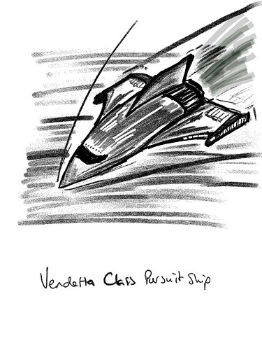
Sketch example exported as a PNG


How do you use it?
The most important thing I did before I started to use the device was to decide on a folder structure so I could find notebooks quickly. I've stuck with this since and rarely struggle to find documents. I tend to have separate notebooks for regular meetings with team members and stakeholders, and key meetings will also have their own separate notebooks. This means I can quickly review previous contacts and sessions and everything is together. With some meetings, I just send out a PDF of the relevant pages as notes.

I have a PDF diary I can make casual notes on, a page a day, with a table of content allowing interlinking so I can jump around.

I'll quite often take the reMarkable into the garden and use it on calls for notes. 

I have used OCR more recently (after the kids swiped my notebook when I was away) and have found it to be really good.

I do have some custom templates for meetings and some business tools, but they don't get used as much as the simple lined pages.

I use the storyboard template for more complicated presentation preparation and also send a PDF of presentations to use to reference.

The device is used throughout the day, and I also use it for roleplaying game preparation, both as a GM and a player. I've put maps on and annotated them, and filled in forms like character sheets. I've also sent forms that need filling in and signing back and forwards between the device.

I switch between the Staedtler Norris Digital Jumbo and the Marker plus. I probably use the Marker plus 75% of the time. The different feel is nice.

I have a passcode if the device is shutdown or sleeping.


reMarkable sleep screen
Custom screen

What more?
You can hack the reMarkable. I've installed customised boot and sleeping screens. The image above is the first attempt; it now has my contact details on it. As it's e-Ink, it stays there even when it powers off. I use some macOS software from eInkpads to install these, but there are other tools out there and if you're competent at Linux you can do it through a terminal when connected by USB. I've also installed custom templates (often created from PDF originals) to allow more flexibility.

You lose all these when the device updates. It takes about a minute or two to reinstall if you're prepared. I have all the templates and screens ready in a folder.

You can hack it more and add apps. It's a grey area whether this damages your warrantee. ReMarkable have usually not had an issue with templates or boot screens (as they're just PNG files added in) but the other hacks can trash your OS if you don't know what you're doing.

Conclusion
The reMarkable has been a game-changer for me. It's helped with focus and also made information available easily. It works outside. I no longer have a bag full of notebooks. It feels like working with a pen and paper, just digital. I do miss the ritual of filling the fountain pen, but the flexibility wins.

Jill liked it enough that I took the hints and got her one. So we've two in the family. Aidan (our left-handed child) likes to use it because he doesn't smudge his work with a pen.

There are other tablets that do the same thing. Most are running Android, so lose the focus side I love with this. Every review I've seen has said that none of them matches the feel of the reMarkable. But they may work better for you. 

I'm delighted with my reMarkable, and thankful that Tim gave me enough insight that I was happy to chance getting one for myself. Although, it was never that much of a chance because they offer a 30-day no-quibble return if you don't like it.

5 September 2021

PS If you do fancy getting one, message me, as I have a discount code that I can share with you that takes 40 dollars/Euros/pounds off. All owners who keep their reMarkable get sent a link like this.