 |
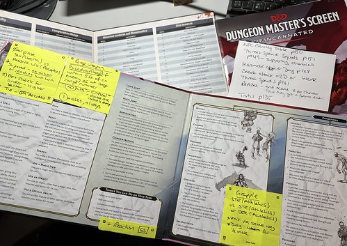
| A selection of screens. |
Last night, I was working through my prep for running Achtung! Cthulhu when I reached the point that I had a look at the GM Screen. I’m approaching this system a little different to the other iterations of 2d20 that I’ve run (Star Trek Adventures and Dune) as this time I’ve not gone and created a full crib sheet for the game. The family resemblance of the later 2d20 games is pretty strong, and I felt that I should be able to run it referencing the GM Screen.
When I ran Curse of Strahd, it was my first exposure to D&D 5e and I ended up sticking a set of Post-it notes over the screen with the key rules that I could needed to reference and couldn’t remember. By the time we’d completed the first season, I’d reached the point that I was mainly using the screen, with occasional references to DnD Beyond or Alex(*). Towards the end, I was hardly referencing it at all.
(*) Every campaign needs an Alex, a player who’s spent the time with the books and knows how things work and can quickly reference or check something. Co-opt, don’t be threatened, as they help you focus on the flow of the session.
Anyway, the Achtung! Cthulhu screen as a four-panel portrait format screen, solidly built and nicely illustrated. However, when I looked at the content for use at the table, I was confused.
Stepping back; when I was younger, and didn’t have the disposable income, I used to create crib sheets for all my games to use at the table rather than buy a GM screen. It’s still a way that I learn games. However, now that I’m time-poor and able to afford buying a screen, I tend to pick them up.
Beyond the obvious part of screening off some of your notes from the players, what I look for in a screen is the quick reference material that I need when I’m GMing. Key rules or procedures, ideally with references to the pages in the book. To me, that’s the purpose of a screen; a barrier and references.
What jarred with me on the Achtung! Cthulhu screen was that one-and-a-half panels were dedicated to random tables for opponents and a picture. Over a third of the screen area wasted from my perspective, as it’s hugely unlikely I’d reference one of these in play; it’s not a D&D style game where you regularly roll for random encounters. The NPC quality table and abilities would have been more useful. Procedurally, the task mechanics were missing, and there was nothing on threat spends, dealing with squads, magic or truths. All fixable, but pretty surprising to me.
It led me to consider how GM Screens are designed. Although I’m talking about a specific games’ screen, there are many other examples like this. It just didn’t feel like it was something that had been planned for use at the table. In some cases, the screen should help understanding of more complex rules (for example, the DGP screen for MegaTraveller managed to express the combat flow much more clearly and concisely than the rules did).
To me the purpose of a screen is to be a sharp, focused reference for the GM. Filling them with cruft and things that won’t get used very often is a criminal waste of time and space.
What do you look for in a GM Screen?
20 November 2023
No comments:
Post a Comment