 |
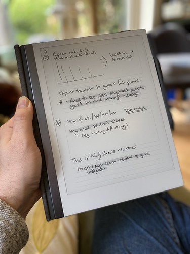
| Taking notes on the reMarkable as I read a roleplaying game. |
A couple of people have asked me to post about my reMarkable writing tablet, so here are my thoughts on the device after ten months of heavy use. This is not a detailed review of the device, but a talk through of what it is and why I like it. If you want detailed techy details, I suggest a look at My Deep Guide on YouTube as the channel owner loves the platform, produces comprehensive reviews on the updates, and isn't afraid of criticising aspects of the platform.
I'd eyed up the original reMarkable when it first came out but decided against it. It was a lot of money and I wasn't entirely certain that it would fit my workflows. Although an e-Ink writing tablet seemed a great idea, I wasn't sure if it would end up with the same fate as the iPad mini had, being used in a very small number of situations. I was massively encouraged by one of my fellow Travellers, Timothy Collinson, who had given a glowing review of his experience of using a work provided reMarkable 1.
When the reMarkable 2 was announced, the advertising was all over Facebook, and I had changed jobs. I was using several Leuchterm notebooks a year using a nice fountain pen, but the challenge of finding things and the bulk of carrying them as references was a pain. I love the feel of writing with a proper pen, the scratching noise that it makes on paper and the satisfaction that looking back through notes gave me. It looked much more tempting; what swung my decision was the payment for a writing project, which enabled me to pre-order without any real loss. I first checked back in with Timothy, who told me that he hadn't changed his mind and was getting one for his own use.
 |
| Using a storyboard template to plan a presentation for work |
What is a reMarkable?
A reMarkable is a 10" ARM-powered tablet that uses an e-Ink display, and an EMR stylus to allow you to write directly on the screen. It runs bespoke software under Linux (and you can hack it if you want). It is designed by a company based in Norway and manufactured - as most technology seems to be - in China. It is extremely thin and quite light. The e-Ink display means that it's fully readable in daylight and has lower power consumption, but it is black & white and the update is slower than the LCDs and OLED displays used by Android tablets and iPads. It isn't backlit, so relies on the ambient light in the same way that a book does. It isn't backlit like modern Kindles (which use similar, smaller displays).
The EMR stylus uses the graphics tablet technology developed by Wacom and is pressure-sensitive. There are two types available; those with an eraser on top and those without. I have the eraser and wouldn't be without it. You can use alternative makes, such as Staedtler or Lamy. The reMarkable stylus comes with a consumable nib; I've used two in the ten months since I started using the device. The nib - when combined with the screen surface - gives the tactile feel of writing on paper.
But couldn't you do this with an iPad?
Absolutely. You could buy a 10" iPad (the kind that uses the Apple Pencil 2), add the Paperlike screen covering, and get somewhere near. You lose the ability to work outside in bright sunlight, and the feeling won't be the same. You also lose the advantage of the focus it delivers. One of the best things about the reMarkable is the way that it lets you use it as if a pad of paper. It feels like one, and behaves like one, in a way an iPad doesn't. Pads of paper don't flash you with notifications or tempt you to visit a social media site. The iPad is a jack-of-all-trades; the reMarkable has a laser focus on one thing.
What is it like?
The reMarkable 2 is incredibly thin, yet feels solid. It's a quality product. I have mine in the book folio (taking advantage of the large discount at launch) which is great for casual protection but isn't going to protect from impacts or drops especially well. I have an iPad sleeve I use when I'm carrying it around because I treat it like it's £500 of hardware. The Facebook groups are full of horror stories where people forget this and end up cracking the screen or damaging the power connector or button by dropping from a height and yet seeming to be surprised about the outcome. I love the design and feel of the device; it feels good in the hand and in use.
The screen has a slight grey colour, which is to be expected for e-Ink, and isn't backlit. This is partly about the design ethos (paper isn't backlit) and partly about battery life. The writing experience does feel very like a pen to paper, unlike the feel of writing on glass that an iPad gives you. The screen is very responsive - there's no perceptible lag - and accurate except at the very edge (common with other devices that use the Wacom technology). The end result is that my writing looks normal. The screen can show ghosting, but it's rarely noticeable, and a refresh clears it.
 |
| Spare marker nibs - found in the pen box. |
The pen magnetically attaches to the side, and there's one correct orientation to do this. It's secure enough for casual use but you can brush the pen off like any other magnetic device. The folio cover also attaches magnetically to the device. The screen can become temporarily unresponsive if you put it over a strong magnet (for example lean it on a laptop palm-rest). I've also managed to put my laptop to sleep by putting my reMarkable on top of the open-close magnetic sensor by mistake. The marker-plus pen with the eraser has some heft (in a good way) and feels great in the hand. I've used two nibs since I received the device in November 2020; if you press hard (which isn't necessary) you will use them up faster. I also have a Staedtler Norris Digital Jumbo pen to give me an option to have a different feel in my hand; this works great, but the (once again consumable) nibs have a more rubbery different texture in use.
There are multiple pen types set up in software; ballpoint, fineliner, pencil, mechanical pencil, marker, brush, calligraphy pen. You can change the weight and colour (between white, black and grey). Some of the pens respond to angle and pressure depending on the type they're mimicking.
PDF and ePub rendering is fine, but it can be slow when the document is large and you first load it in. Colour is rendered in greyscale. You can write on the documents and export a copy PDF out for reference or printing. However, remember that this is like handwriting on a print-out rather than using Acrobat annotation tools.
The reMarkable comes with a wide selection of templates - lined, gridded, storyboards and more. You can use a different one on each page. Officially, you can't add your own but you can use PDF files (but they can't have extra pages added).
 |
| Thumbnail overview |
The OS is Linux based and under regular development; the last update (2.9) added a favourites shelf accessible by a swipe and an alternative in document page preview/selector very much like the one on the Kindle. This is in addition to the page overview view which shows thumbnails. I've not had any stability issues with the device.
 |
| The page selector added in update 2.9 |
The data on the reMarkable is backed up into Google's cloud infrastructure and the only access into it is through the device or through the companion apps (which use 2FA on set up with the devices). I have installed the iOS & Android apps and the macOS app. If you want to add PDFs or ePubs to the tablet, you use the app. It'd be nice to have an email address route like Kindles do but that doesn't exist at the moment. Cloud sync is pretty fast; obviously, it takes longer if you've been running for longer periods without Wifi. I'll quite often run with no Wifi if I'm away from home and only connect when I need to, using the flight mode to extend the battery life. I get around five to six days from the battery, but I don't use the PDF side too often.
 |
| The OCR function works quite well - this is one of this blog's entries. |
You can export single pages or whole documents, and the device supports PDF, PNG and SVG. Usually, if I want a quick print, I'll print from one of the companion apps as the reMarkable doesn't do it directly. You can also OCR pages directly to text; this does require a WiFi connection, as the processing is handled off-device. Provided you're writing neatly and in portrait then the conversion seems very good. The Tombpunk review earlier in this blog was completely written on the device. You can edit the conversion before you email it. It's not blindly fast, but it seemed reasonable in use.
 |
| Multi-layer design example |
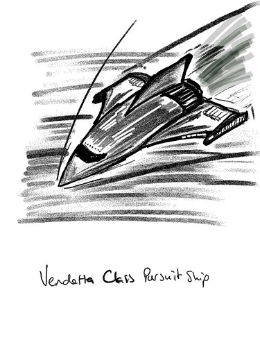
The device uses layers, so you can build up an image; the only non-greyscale element is the highlighter (which is yellow on export) but it's grey in use. You can build quite intricate designs as a result. Sketching also works fine and I've seen some great pictures from people who are much more artistic than I am.
 |
| Sketch example exported as a PNG |
How do you use it?
The most important thing I did before I started to use the device was to decide on a folder structure so I could find notebooks quickly. I've stuck with this since and rarely struggle to find documents. I tend to have separate notebooks for regular meetings with team members and stakeholders, and key meetings will also have their own separate notebooks. This means I can quickly review previous contacts and sessions and everything is together. With some meetings, I just send out a PDF of the relevant pages as notes.
I have a PDF diary I can make casual notes on, a page a day, with a table of content allowing interlinking so I can jump around.
I'll quite often take the reMarkable into the garden and use it on calls for notes.
I have used OCR more recently (after the kids swiped my notebook when I was away) and have found it to be really good.
I do have some custom templates for meetings and some business tools, but they don't get used as much as the simple lined pages.
I use the storyboard template for more complicated presentation preparation and also send a PDF of presentations to use to reference.
The device is used throughout the day, and I also use it for roleplaying game preparation, both as a GM and a player. I've put maps on and annotated them, and filled in forms like character sheets. I've also sent forms that need filling in and signing back and forwards between the device.
I switch between the Staedtler Norris Digital Jumbo and the Marker plus. I probably use the Marker plus 75% of the time. The different feel is nice.
I have a passcode if the device is shutdown or sleeping.
 |
| Custom screen |
What more?
You can hack the reMarkable. I've installed customised boot and sleeping screens. The image above is the first attempt; it now has my contact details on it. As it's e-Ink, it stays there even when it powers off. I use some macOS software from eInkpads to install these, but there are other tools out there and if you're competent at Linux you can do it through a terminal when connected by USB. I've also installed custom templates (often created from PDF originals) to allow more flexibility.
You lose all these when the device updates. It takes about a minute or two to reinstall if you're prepared. I have all the templates and screens ready in a folder.
You can hack it more and add apps. It's a grey area whether this damages your warrantee. ReMarkable have usually not had an issue with templates or boot screens (as they're just PNG files added in) but the other hacks can trash your OS if you don't know what you're doing.
Conclusion
The reMarkable has been a game-changer for me. It's helped with focus and also made information available easily. It works outside. I no longer have a bag full of notebooks. It feels like working with a pen and paper, just digital. I do miss the ritual of filling the fountain pen, but the flexibility wins.
Jill liked it enough that I took the hints and got her one. So we've two in the family. Aidan (our left-handed child) likes to use it because he doesn't smudge his work with a pen.
There are other tablets that do the same thing. Most are running Android, so lose the focus side I love with this. Every review I've seen has said that none of them matches the feel of the reMarkable. But they may work better for you.
I'm delighted with my reMarkable, and thankful that Tim gave me enough insight that I was happy to chance getting one for myself. Although, it was never that much of a chance because they offer a 30-day no-quibble return if you don't like it.
5 September 2021
PS If you do fancy getting one, message me, as I have a discount code that I can share with you that takes 40 dollars/Euros/pounds off. All owners who keep their reMarkable get sent a link like this.


